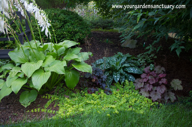
Last post, we looked at plants from the view point of texture. We saw that plants can be Coarse (or bold), Medium-Coarse, Medium, Medium-Fine, and Fine textured.
What to do with texture
Due to the fact that the chlorophyll in plants is green, most plants are a shade of green. There are many different greens in the garden world, but they can all still blend together. This is especially true if they all have the same texture.
If you want your gardens plantings to look interesting throughout the season you need to consider texture.
Using plant texture to create depth
Bold textured plants appear closer then they really are. Fine textured plants appear farther away.
Therefore if you want to make a small bed seem larger and deeper, you can use this to your advantage and plant coarser (bolder) textured plants in the front of a bed. Medium textured plants would go in the middle of the bed. Fine textured plants should be planted in the back of the bed.
If you want a large area to appear smaller and more intimate, reverse those suggestions.
How many plants of each texture should you include
Of course, there are no absolute rules, but I will give suggestions that seem to work well.
Most plants should be medium textured.
Too many coarse textured plants can jar the eye and look, shall we say, rough or coarse.
Too many fine textured plants and it look too busy. It all becomes a jumbled mess.
Of course, there are exceptions, mixing a few medium textured plants in a sea of fine textured plants can result in a nice composition. That is as long as there is strong use and repetition of color.
This photo of the Lurie garden in Chicago shows how varying shades and hues of purple can create order and interest in a largely fine textured planting.

If you take those color changes away, it starts to become more jumbled.

How to change textures
It is often best to change textures gradually through a planting, perhaps a medium fine plant next to a medium textured plant. Then perhaps a medium coarse plant. The key is to provide variety through gradual transitions in your plant textures.
Here is an example from my yard of a planting (minus a key weeping purple Japanese maple that some $@#! rabbits chewed down!). It’s nothing spectacular, but it shows how textures can be alternated to create a bit more interest then if they were not.

Here is how I see the textures of these plants. As you can see, there is a variety here from coarse to fine.
Of course, even if you make sure your plantings have interesting texture combinations, you can still add a variety of foliage colors to add even more interest.
Sketch using plant textures in the garden
A good way to use plant textures is to take a photo of your garden scene like I did above. Then you can turn it into a black and white photo to get rid of the distraction of looking at different colors.
You can then draw outlines on a piece of paper to represent the plant groupings and write each’s texture. It may be easier to only use the three textures of Coarse, Medium, and Fine. If you feel confident you could also through in the Medium Fine and Medium coarse categories. It could look like this.

Then go back and replace the names with a line pattern to represent the texture. Use a far apart line pattern to represent the coarser or bolder textures. Use a closer line pattern for the finer textures.

This can help to show you if your plant textures smoothly fluctuate as your eye moves through your planting. If not, you can consider adding, removing, or moving plants to help do that.


Leave a Reply